Choosing the Perfect Color Scheme
Choosing the perfect color scheme for your home is not just about aesthetics, it’s about creating a harmonious environment that reflects your personality and supports your well-being. In this article, I’ll guide you through the essentials, giving you the tools and confidence to choose colors that truly work for your home.
by Natasha Del Brocco
3/14/2025


Choosing the perfect color scheme for your home is not just about aesthetics, it’s about creating a harmonious environment that reflects your personality and supports your well-being. The right palette can completely transform a space, turning it into a happy place where you and your family love to spend time.
That said, color theory in interior design is a fascinating, and often complex, subject. It goes far beyond simply picking your favorite shades; it’s about understanding how colors interact, how they influence mood, and how they shape the way we perceive a room.
But don’t worry, in this article, I won’t overwhelm you with technicalities. I’ll guide you through the essentials, giving you the tools and confidence to choose colors that truly work for your home.
1. Understanding Color Theory
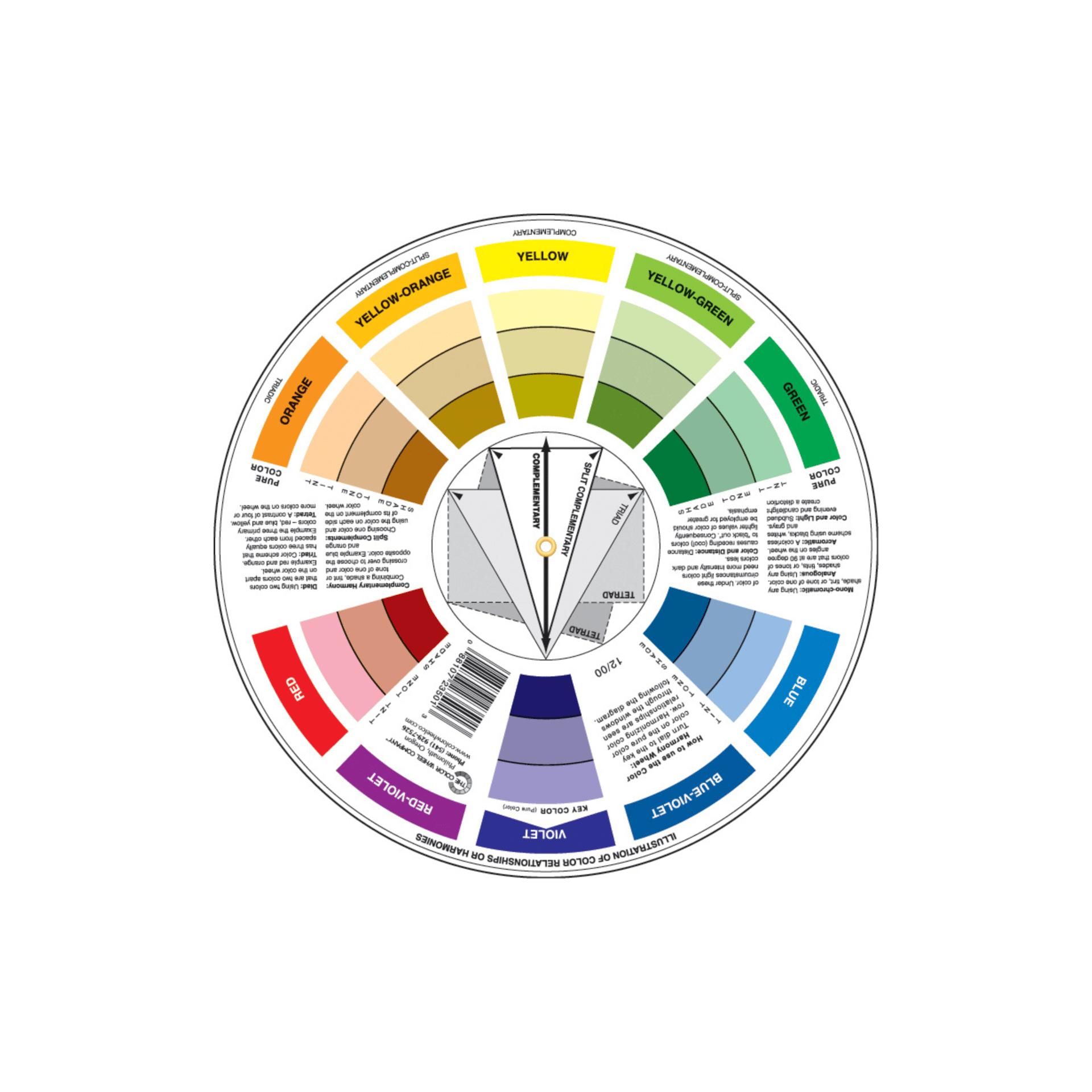
Color Theory is a tool that designers and artists use to create pleasing color combinations.
Familiarizing yourself with a few fundamental concepts can significantly improve your color selection process:
Color Wheel:
This circular diagram represents the spectrum of colors.
Understanding how colors relate to each other on the wheel can help you make informed choices.
Primary, Secondary, and Tertiary Colors:
Primary colors Red, Blue, Yellow are the building blocks of all other colors.
Secondary colors Green, Orange, Purple are created by mixing primary colors
Tertiary colors are made by mixing primary and secondary colors.
Warm vs. Cool Colors:
Warm colors Reds, Oranges, Yellows tend to evoke emotions of warmth and energy
Cool colors Blues, Greens, Purples are often calming and refreshing.
Monochromatic Color Schemes:
A monochromatic color scheme uses different shades of one color.
It creates a smooth and connected look.
This style is great for making a room feel bigger and more unified.
Complementary Colors:
These are opposite each other on the color wheel and can create a vibrant look when used together.
For example, Blue & Orange or Yellow & Purple.
Analogous Colors:
These are next to each other on the color wheel, such as Blue, Blue-Green, and Green.
They typically create a serene and comfortable design.
Triadic color schemes:
Use three colors that are evenly spaced on the color wheel. This mix creates a lively and balanced palette.
It's great for adding color and interest to a room.
2. Consider Your Space
The purpose and feel of each space in your home should guide your color choices:
Living Room:
This is often the focal point of the home and where families gather.
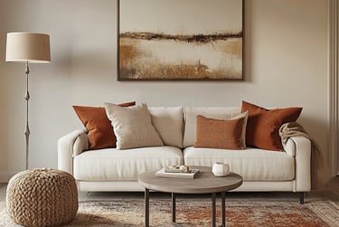
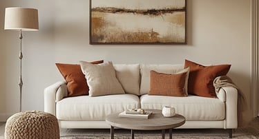
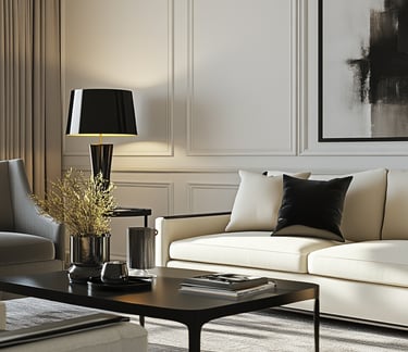
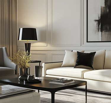
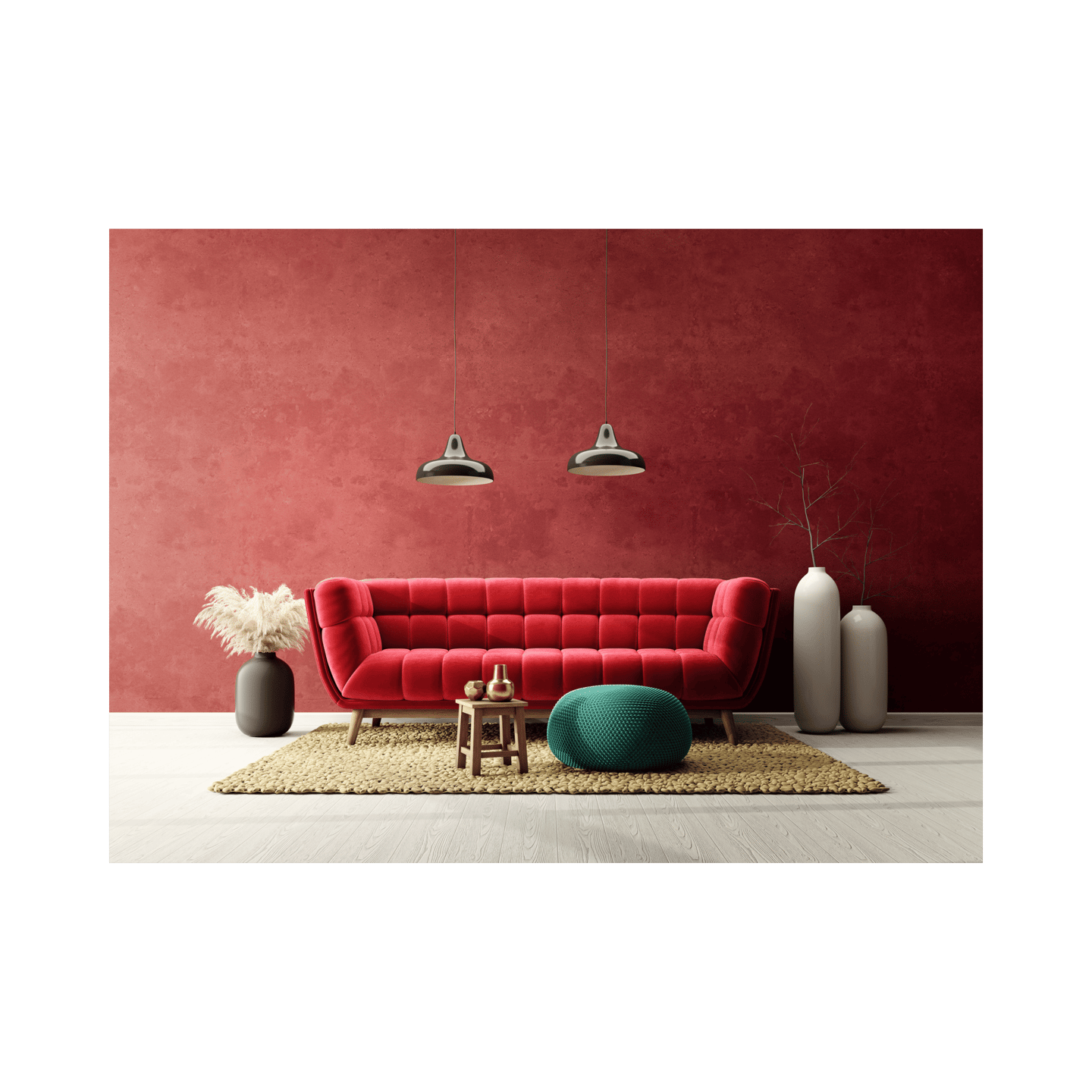
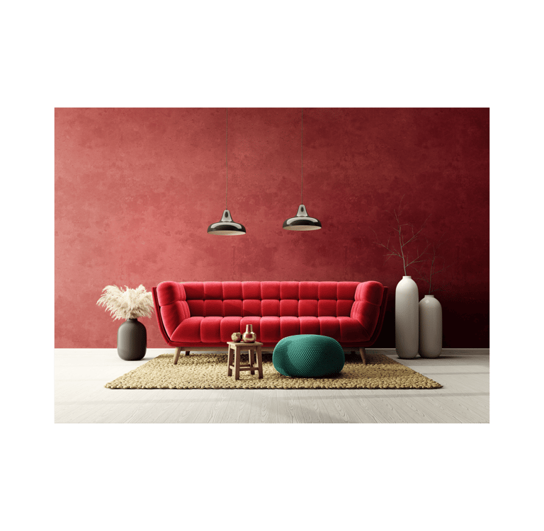
Warm, inviting colors like Soft Oranges, Rich Browns, or Muted Reds can create a cozy atmosphere.
On the other hand, if you prefer a more calming feel, consider using cool hues like Soft Blues or Greens.
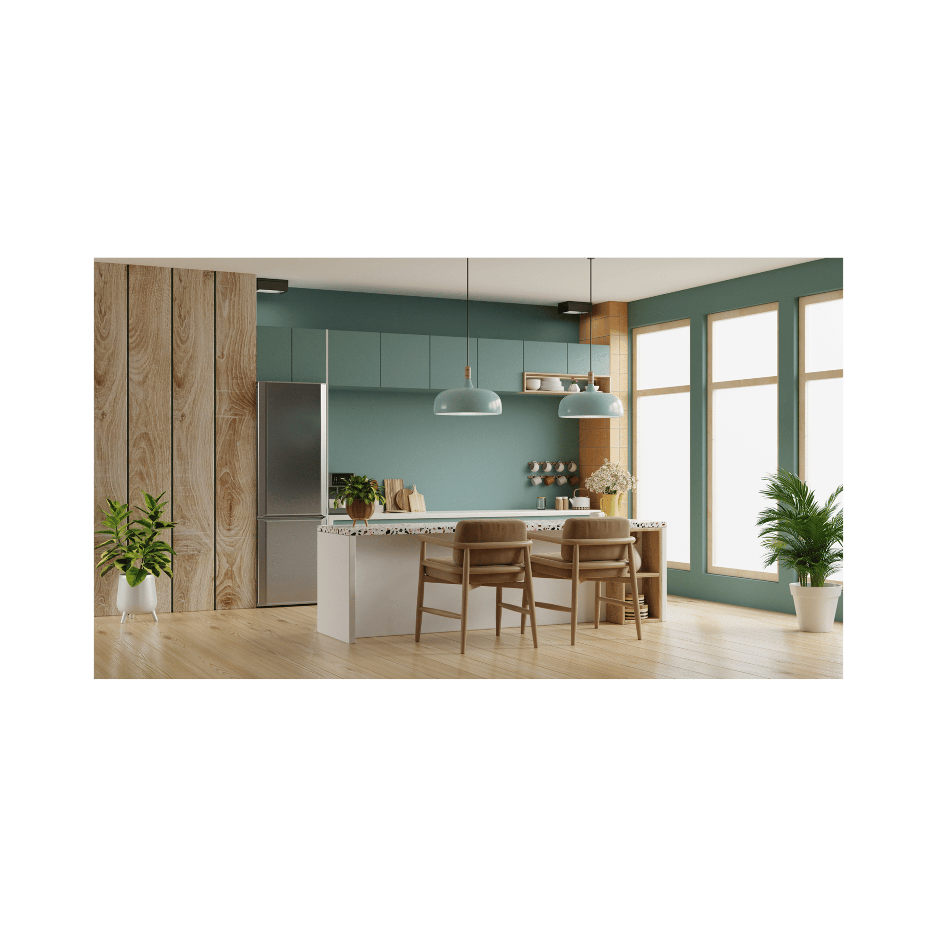
Kitchen:
Here, cheerful colors can inspire creativity. Bright Yellows or Fresh Greens can impart a lively feeling.
If you have a smaller kitchen, consider lighter tones to make the space appear larger.
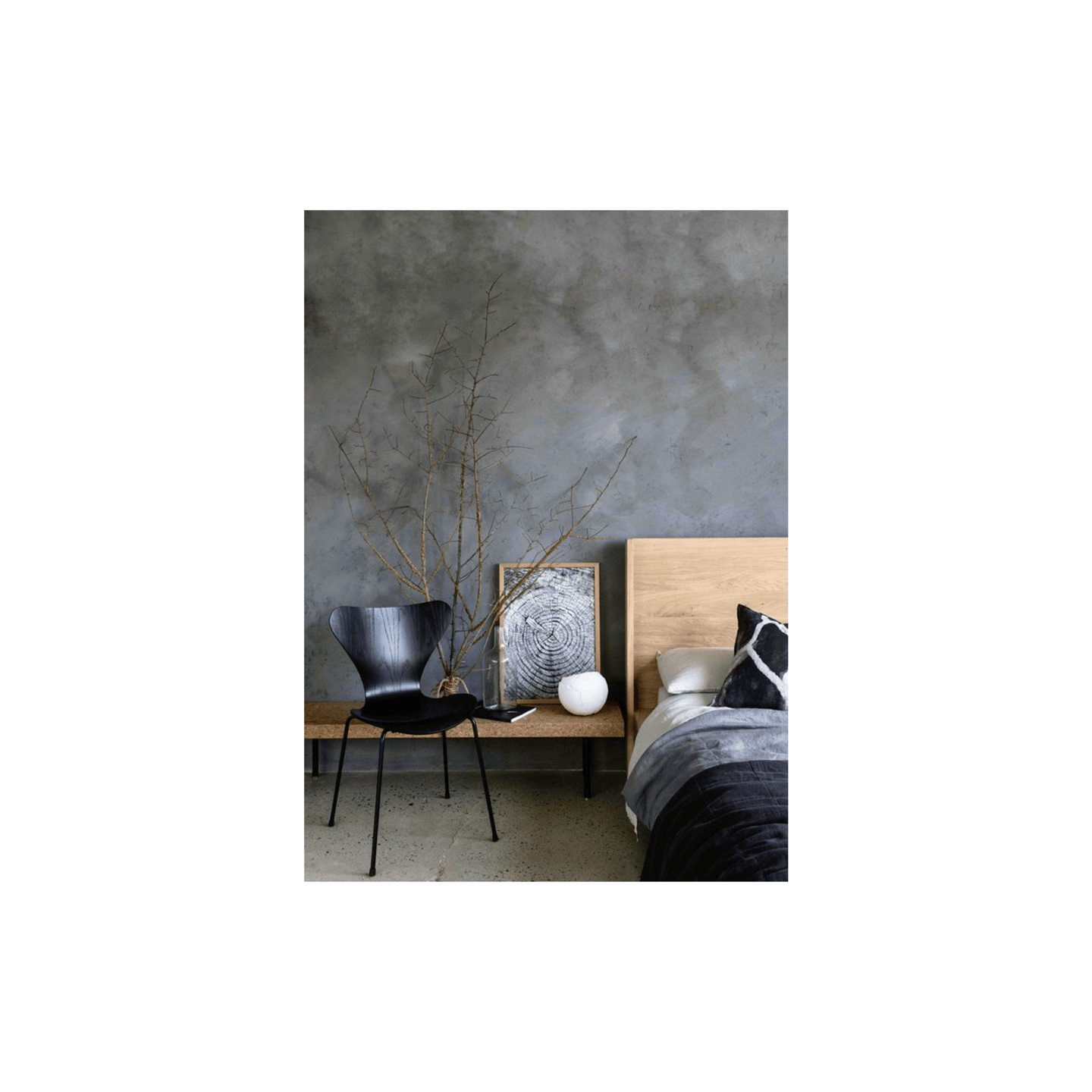
Bedrooms:
For relaxation, soft, cool colors like light Blues, Lavenders, or Grays can create a serene environment conducive to sleep.
Home Office:
A space for productivity should ideally have colors that enhance focus.
Consider using energetic colors like Green or Blue, which are said to improve concentration.
3. Natural Light and Size Matters
Light significantly influences how colors appear. Take note of how natural light enters your space at different times of the day:
Bright, Sunny spaces:
You can afford to use darker or more Vibrant Colors without them feeling overwhelming. Warmer tones will also create a welcoming feel.
Dimly lit rooms:
Light colors can help brighten up the space, making it feel more open and airy. Soft Whites, Pastels, and Light Grays work well here.
Room Size:
Smaller rooms benefit from Lighter shades, while larger spaces can handle Bolder colors.
A larger room accentuated with dark colors can be broken up with lighter furniture or textiles to prevent it from feeling too cramped.
4. Use Color Samples
Before committing to a color, it’s highly beneficial to test samples in the actual space. Paint swatches on your wall and observe how they change throughout the day in different lighting. Look at them during different times to determine how they’ll feel in various conditions.
5. Create a Color Palette
Once you've narrowed down your color choices, consider developing a color palette:
Base Color: Choose a base color that will dominate your interiors.
Accent Colors: Pick one or two accent colors that complement your base.
These will be used in furnishings, artwork, or decorative elements.
Neutrals: Integrate neutral tones to balance out the brightness of your palette.
Whites, Grays, or Beiges work well and can offer a backdrop that allows your chosen colors to pop.
6. Tips for Combining Colors Effectively
A well-designed color scheme is key to a beautiful home. It can make your space feel cozy and stylish.
To create a harmonious color palette, follow these tips:
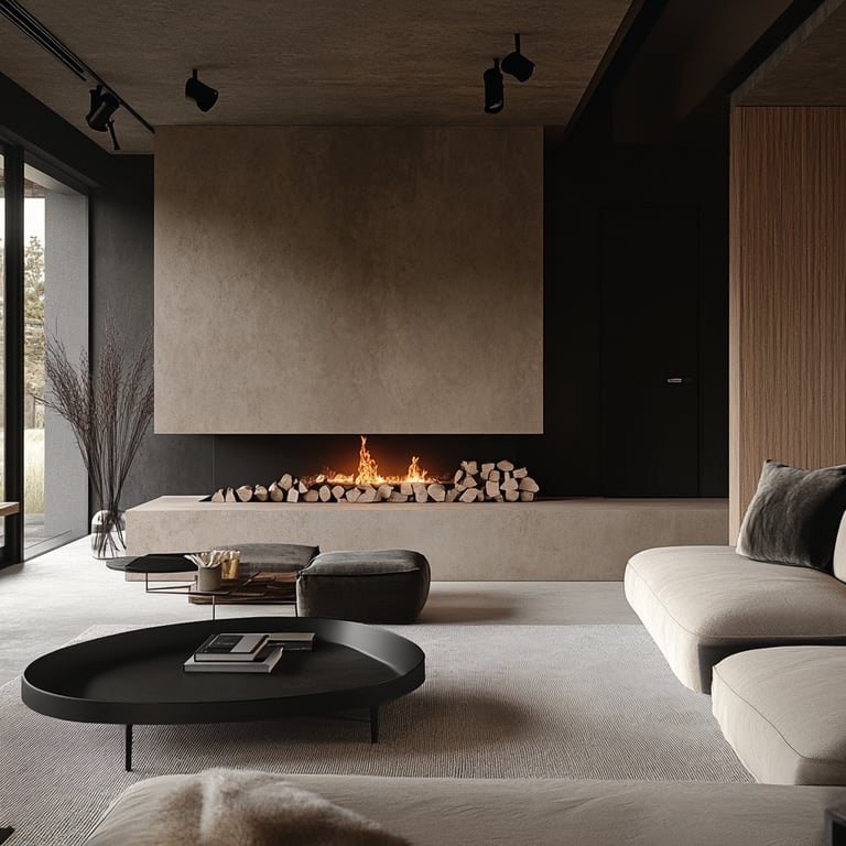
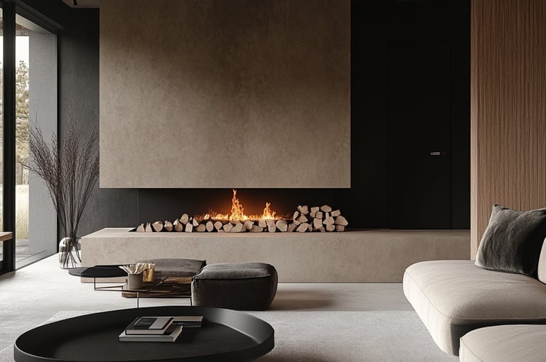
Start with a Focal Point
First, find a focal point in the room. It could be a fireplace, an standout piece of furniture or art. This will help you build a cohesive color scheme around it.
Use 60-30-10 Rule
The 60-30-10 rule is great for a balanced color scheme. Use 60% of the room for a main color, 30% for a secondary, and 10% for an accent. This balance brings harmony and interest.
Balance Warm and Cool Tones
It's important to balance warm and cool tones in your color scheme. Warm colors like oranges and reds add energy and warmth. Cool colors, such as blues and greens, bring calm. Finding a balance between them makes your space look good and feel right.
By using these tips, you can make a popular color scheme that looks great and works well. The secret to a good color scheme is balance and harmony.
7. Tools and Resources for Color Selection
Finding the perfect color scheme can be easier than what you think. Thanks to many tools and resources, picking colors is now simpler. Whether you're updating your home or designing a new project, these tools help create beautiful color palettes.
Color Palette Generators
Color palette generators are online tools that help you pick a color scheme. They suggest colors that work well
together.
You can find many online, with options to customize and use color picker tools.
Color Wheel Apps
Color wheel apps show the color wheel and help you pick harmonious colors. They often have features like color matching and augmented reality (AR). This lets you see colors in your space before painting.
Using these tools makes choosing colors easier. They help ensure your color scheme enhances your space's beauty and function.
Here are some of the most popular and user-friendly ones, perfect for anyone choosing colors for their home:
Coolors: A fast and fun way to build palettes. You can start from any color, lock it, and hit the spacebar to generate matching palettes. It also allows extracting palettes from photos and checking color contrast.
Adobe Color: A versatile color wheel tool that supports color theory harmonies (analogous, triadic, monochromatic, etc.). You can extract palettes from images, get RGB/HEX values, and check accessibility compliance
Paletton: Great for hands-on color wheel exploration. You can generate monochromatic, complementary, triad, tetrad schemes and preview them in realistic mockups
Many top paint brands also offer their own color selection tools—specifically designed to help homeowners visualize paint colors in real spaces. Here are some excellent options to consider:
Benjamin Moore – Color Portfolio App & Personal Color Viewer
Explore curated palettes or upload a photo of your room to digitally paint it. Their app also helps you find matching color families and visualize shades in real time.
Sherwin-Williams – ColorSnap Visualizer
An intuitive tool that lets you try out paint colors on sample rooms or your own uploaded photos. Also includes themed palettes and trending color collections.
8. Emotional Impact of Colors
Colors can evoke strong emotional responses, so it’s imperative to consider the feelings they inspire:
Red: Passionate and vibrant; encourages energy and activity.
Blue: Calming and soothing; promotes tranquility.
Yellow: Cheerful and bright; encourages happiness but can be overwhelming in large doses.
Green: Refreshing and harmonious; connects with nature, promoting balance and serenity.
Purple: Luxurious and spiritual; encourages creativity but can feel heavy if overly applied.
9. Consider Existing Elements
When choosing colors, consider the existing elements of your home, such as:
Furniture and Decor:
Ensure the colors complement your furnishings. If you have a statement piece, like a colorful sofa, choose wall colors that enhance rather than clash with it.
Flooring:
Different flooring styles could influence your choice of wall and decor colors. For example, a dark wood floor may create a warm backdrop for lighter wall colors.
10. Look for Inspiration
Inspiration can come from various sources:
Nature: The colors you see outdoors provide incredible palettes. Leafy greens, vibrant flowers, and earthy browns can translate beautifully indoors.
Art: A favorite painting or print can serve as the foundation for your color scheme.
Fashion and Textiles: Patterns and shades in clothing can stimulate ideas for interiors, especially in upholstery and curtains.
Conclusion
The process of selecting the perfect color scheme for your home should be enjoyable and fulfilling. Embrace your creativity and allow your personal style to shine through your color choices.
By understanding the basics of color theory, considering the unique aspects of your space, and taking the time to experiment, you can create a home environment that is not just visually stunning, but also truly reflects who you are as a family. Ultimately, your home should be a space where you all feel comfortable and relaxed.
So take your time, immerse yourself in the world of colors, and watch as your living space transforms into a perfect retreat.
💬 Let’s Chat
Which part of this post helped the most or made you rethink your color choices?
Leave a comment below or share your Color Scheme with me at natasha@thepathtodesign.com. I’d love to see your vision come to life!
💌 Don’t Miss the Series
Join The Path to Design Weekly and get each lesson delivered straight to your inbox. You’ll receive bonus printables, checklists, and design tips that make every step of your home journey feel doable (and exciting!).
Happy Decorating!


I am Natasha Del Brocco, interior designer, founder of HomeValley Interiors & of ‘The Path to Design" Hub. I am passionate about creating homes that Feel as good as they look. With a love for Nature, Art, and Animals, I help home lovers like you design beautiful, functional, and pet-friendly spaces that reflect who you are. Through my blog and eBooks, I share expert advice, smart solutions and inspiring ideas to help you fall in love with your home all over again.
Disclaimer: This site includes affiliate links that may earn me a commission at no additional cost to you. I only recommend products I truly believe in and that can make your home more beautiful and functional.

What I Do
natasha@thepathtodesign.com
Join my Email List for Inspirational & Strategic Newsletters
Who I Am